How does the design of Champagne promote its importance?
“I only drink champagne when i’m happy and when i’m sad. Sometimes I drink it when I’m alone. When I have company I consider it obligatory. I trifle with it if I’m not hungry and I drink it when I am. Otherwise I never touch it —- unless I’m thirsty.”
-- Lily Bollinger –
Champagne is perfectly suited to any occasion (so long as you’ve got the money to afford it). Champagne is special compared to other alcoholic drinks and unless you LIly Bollinger its a drink for special occasions like christmas morning (and throughout the day), New Years, Birthdays and even funerals (that is if you are of the opinion that you must celebrate life at a funeral). But how does champagne stand out when it comes to design?
First some background
- Location : French region of Champagne
- Ageing : Minimum of fifteen months
- Grapes : A blend of Pinot Noir, Pinot Meunier and Chardonnay
- Winemaking Method : create a still wine and then bottling it with yeast and sugar
- Bubbles : Very fine looking
- Price : High (in comparison to other sparking wines)
Is any of this prominent in the design?
Lets have a look at some well-known labels…

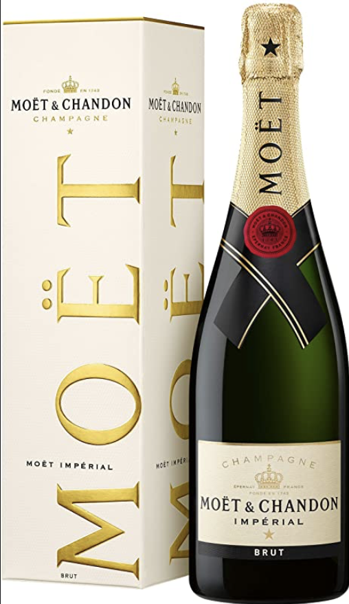
Simple but elegant, this bottle looks classy and expensive.Having a box for the champagne to arrive in makes us feel like its special, and i guess after taking a minimum of fifteen months to make it really is.We instantly know from looking at this bottle where its come from due to its name with the use of ‘ë’. The font is simple and looks rather similar to Times New Roman. It makes use of serifs which in this case are sharp, the font also has a high contrast which makes it look classic.

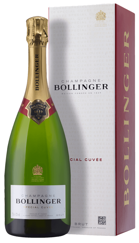
This bottle looks important. If the royal seal isn’t enough then take a look at the medal round the bottles neak. The use of green, gold black and white also helps to heighten its eliteness. The fonts used look similar to Brushine Collective Font, the combination of having the text made up of capital letters along with the font’s sharp ages and thickness puts emphasis on the word and promotes its importance. The font also uses serifs and has a high contrast just like the Moet it looks classic and elegant.

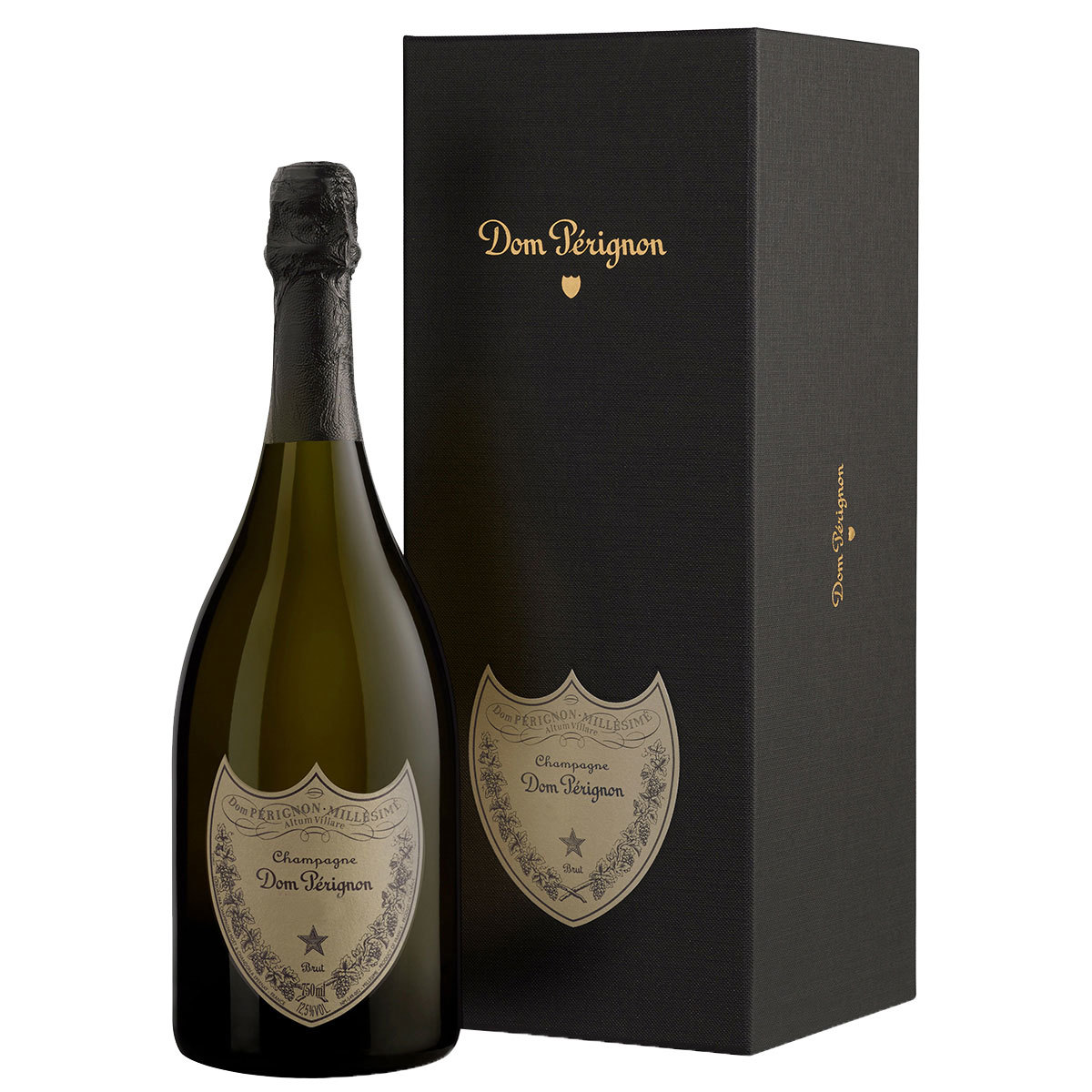
In comparecen to the others Don Perion could not look less alike.
It’s gothic, but not in a weird teenager dressing head to toe in black attire kind of way, yet like it belongs to an incredibly beautiful dark and gloomy castle’s dining room. The design of this bottle is clever in the way it’s able to stand out from the rest but notwithstanding its eliteness.
The label on the bottle connotes ideals of a high society’s families crest. The font looks like it’s been written by someone, and they’ve got a fountain pen out and written across the label with beautifully curly writing.
